2 min read

Data Visualization in Nonprofit Finance: Tools for Clarity and Impact

Data Visualization in Nonprofit Finance: Tools for Clarity and Impact

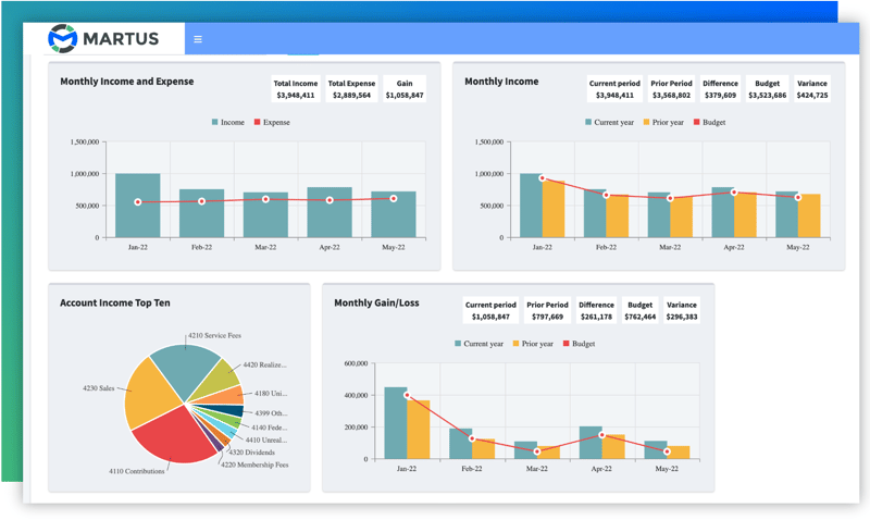
In nonprofit finance, communicating numbers is only part of the equation. What truly makes an impact is presenting financial data in a way that’s clear, compelling, and actionable. Data visualization transforms raw numbers into visuals that tell a story, helping stakeholders, boards, and teams quickly grasp complex financial insights.

Effective data visualization enhances decision-making and builds trust and engagement by showing the connection between financial performance and mission outcomes. Let’s explore why data visualization is essential for nonprofits and how you can leverage tools and best practices to deliver clarity and impact.

Why Data Visualization Matters for Nonprofits

Data visualization bridges the gap between dense spreadsheets and actionable insights by:

  1. Engaging Stakeholders:
    Boards and donors often lack the time or expertise to sift through detailed financial reports. Charts, graphs, and dashboards provide them with a concise, visual understanding of where funds are going and what results they’re achieving.
  2. Simplifying Complex Information:
    Budgets, KPIs, and donor metrics can be overwhelming when presented in tables or text. Visuals like pie charts, heat maps, and trend lines simplify this data, making it easier to digest and analyze.
  3. Driving Better Decision-Making:
    With clear visuals, finance teams can quickly spot trends, identify gaps, and make more informed decisions. For instance, a line graph showing fundraising trends over time might reveal seasonal dips, prompting proactive adjustments to campaigns.

financial metrics example nonprofits

Tools to Power Nonprofit Data Visualization

Many platforms cater to nonprofit needs, combining ease of use with robust functionality. Here are some top picks:

  1. Microsoft Power BI
    Power BI is ideal for creating interactive dashboards that integrate seamlessly with other platforms like Excel and cloud-based accounting tools. It can be used by nonprofits looking to track KPIs and share real-time insights with stakeholders.
  2. Tableau
    Known for its intuitive interface, Tableau enables nonprofits to create visualizations. It’s particularly useful for organizations managing large datasets, offering advanced analytics and storytelling capabilities.
  3. Google Data Studio
    This tool integrates well with Google Sheets and other apps, providing customizable reports and dashboards that make data sharing simple and accessible.
  4. Martus Solutions
    Built specifically for nonprofits, Martus offers features like real-time dashboards and role-based access. Its visual reporting tools connect financial data to mission outcomes, helping teams align strategies with organizational goals.

Best Practices for Nonprofit Data Visualization

Creating effective visuals isn’t only about picking the right tool—it’s about using it strategically. Keep these best practices in mind to ensure your data tells a story that resonates:

  1. Know Your Audience
    Tailor your visuals to your audience's needs. For instance, a detailed bar chart might work for the finance team, while a simple pie chart or infographic might resonate better with donors or board members.
  2. Highlight What Matters
    Focus on key metrics that align with your mission, such as program efficiency ratios, fundraising ROI, or cash flow trends. Avoid overwhelming your audience with too much information.
  3. Choose the Right Visuals.
    Match your data to the type of visual that best represents it. Use:
    • Pie charts for illustrating proportions (e.g., expense allocation).
    • Line graphs for trends over time (e.g., donation patterns).
    • Bar charts for comparing values (e.g., program budgets).
    • Heatmaps to show intensity or frequency (e.g., donor activity by region).

ReportBuilder2

  1. Ensure Accuracy and Clarity
    Double-check data for accuracy, and avoid overly complex designs. Simple, clean visuals with clear labels and legends are more effective than cluttered charts.
  2. Tell a Story
    Use your visuals to create a narrative. For example, show how increased fundraising led to program expansion or how operational savings improved mission delivery.

Make Data Visualization Your Nonprofit’s Secret Weapon

Data visualization is more than a reporting tool—it’s a bridge between financial strategy and mission-driven storytelling. By adopting the right tools, tailoring visuals to your audience, and emphasizing clarity, nonprofits can transform how they communicate impact.

Key benefits include:

  • Engaging Stakeholders: Build trust with clear, compelling visuals.
  • Driving Decisions: Enable teams to act on insights quickly.
  • Showcasing Impact: Highlight how resources are making a difference.

Ready to bring your financial story to life? Download our ebook, "From Survival to Strength: Transforming Nonprofit Finance," for actionable insights, proven strategies, and real-world examples of how data visualization can empower your nonprofit to thrive. Let’s turn your numbers into a mission-driven narrative!

Nonprofit Collaborative Budgeting: Aligning Financial Strategy with Mission Goals

Nonprofit Collaborative Budgeting: Aligning Financial Strategy with Mission Goals

Nonprofits know all too well the importance of making every dollar count. With tight budgets and high expectations to deliver measurable impact,...

Read More
Why Partnering with Martus Solutions is the Right Choice for You and Your Customers

Why Partnering with Martus Solutions is the Right Choice for You and Your Customers

Partnering with Martus Solutions offers organizations the opportunity to enhance their clients' financial technology stack with advanced budgeting,...

Read More
Digital Transformation for Nonprofits: Moving Beyond Survival Mode

Digital Transformation for Nonprofits: Moving Beyond Survival Mode

In the nonprofit world, the call for digital transformation is no longer a matter of "if" but "when." As organizations grapple with increasing donor...

Read More